Tuesday, 27 October 2009
presentation feedback
I'm quite happy with the feedback on my website. I totally agree with adding more details as I'd intended on doing that. I was going to do this all for December, as well as updating my blog as despite doing the work, I haven't always uploaded it to here. That won't be happening now as apparently today was our final hand-in! I suppose this is all good because I have finished it & I have got all my work done, I'd just have liked to continue working on this to improve it for my final grade. I suppose I've got to get on with animation now....fab.
Rational
I've really enjoyed making my website, it's taken me back to my geeky past when I used to make them in my spare time. Despite enjoying it, I did struggle with picking a design. I wanted it perfect & exactly how I saw it in my head, but just couldn't get it right. I feel kind of lucky that I did have a basic understanding of web design because it's meant I've been able to create the site in a couple of days.
Although my overall personal style can change I wanted to go for a more handmade theme. I love working with textures & materials & have always been a sketchy/illustration type person. I do think I've achieved the feel of this on my website but it does need a few extra details, just for depth.
I'm really happy with the final out come of the design, but I do want to go back & add more details & textures. I also really want to get the divs & iframes sorted because having my website all on separate pages is sadly really annoying me. I'd also love to create a few animations, possibly a few scribbles or sketches across the page just to make it a little prettier, because that's what I love, quirky, pretty details.
Overall I've really enjoyed this brief, I'm just really not happy that we've had to do 2 other projects (mainly animation, uuuurgh) alongside of it because I'd have liked to have learnt & experimented more.
It's finished!
So I finally came to a decision on the design & got to making up the pages.
 I want to use the main page to display pieces of my work. Either a weekly pick or a new weekly sketch. It'd be great for it to flick through all of my work, that'd require flash right?
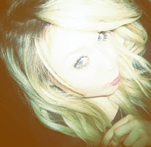
 About me, pretty simple really, putting a face to the name & a little blurb.
 I'll be putting more work up on here, but this was just to display a working site.
 Lightbox! Need to work out the back/next & close.
 More ways to contact, all linked to the sites & email form.
I want to add to this, more textures to add some depth & interest. Maybe some animations?
 I want to use the main page to display pieces of my work. Either a weekly pick or a new weekly sketch. It'd be great for it to flick through all of my work, that'd require flash right?
 About me, pretty simple really, putting a face to the name & a little blurb.
 I'll be putting more work up on here, but this was just to display a working site.
 Lightbox! Need to work out the back/next & close.
 More ways to contact, all linked to the sites & email form.
I want to add to this, more textures to add some depth & interest. Maybe some animations?


Wednesday, 14 October 2009
some website research
Here are some websites I've looked at over the past couple of weeks. Some I like & some are so, so, but I wanted to look at a range of styles.
 www.misprintedtype.com - I love Eduardo Recife's work. His website is very reflective of his style, I love how the page keeps scrolling down eventhough there is no information only little bits of his art.


www.ndmakeupartists.co.uk - Not necessarily a designers portfolio, but still a great website for displaying company information & a portfolio of their artistry. I love the different sections & the depth to the site, very personal.
 www.meghunt.com - I like the use of her own illustrations for a background, but the side column with a scroll bar is just ugly.
 www.alexcoleman.net - This is ok I suppose. The work displayed stands out as the rest of the page is rather bland. Texture gives some detail to the page.
 www.alexcohaniuc.com - Really like this style because I'm a fan of mixing a bit of clean design with more hands on materials such as sticky tape.
 www.rzmota.com - An interesting page but could have been better if the main page was interactive. I do like how the portfolio & information pops up at the bottom & is interactive though.
 www.blkmtnstudio.com - Very blog-like, simple but a nice clean, easy to navigate site.
 www.jayhafling.com - Kind of like one of the sites above, clean design/type mized with textures of paper, gives it a nice depth.
 www.gouramidesign.com - Really like this page, it's really simple, tidy & effective.
 www.laurenfrench.com - Another portfolio site that is quite bloggy, but I know this girl uses her blog on the main page of her portfolio. I love how she displays a piece of her photography even when it's not on the portfolio section.
 www.misprintedtype.com - I love Eduardo Recife's work. His website is very reflective of his style, I love how the page keeps scrolling down eventhough there is no information only little bits of his art.

www.ndmakeupartists.co.uk - Not necessarily a designers portfolio, but still a great website for displaying company information & a portfolio of their artistry. I love the different sections & the depth to the site, very personal.
 www.meghunt.com - I like the use of her own illustrations for a background, but the side column with a scroll bar is just ugly.
 www.alexcoleman.net - This is ok I suppose. The work displayed stands out as the rest of the page is rather bland. Texture gives some detail to the page.
 www.alexcohaniuc.com - Really like this style because I'm a fan of mixing a bit of clean design with more hands on materials such as sticky tape.
 www.rzmota.com - An interesting page but could have been better if the main page was interactive. I do like how the portfolio & information pops up at the bottom & is interactive though.
 www.blkmtnstudio.com - Very blog-like, simple but a nice clean, easy to navigate site.
 www.jayhafling.com - Kind of like one of the sites above, clean design/type mized with textures of paper, gives it a nice depth.
 www.gouramidesign.com - Really like this page, it's really simple, tidy & effective.
 www.laurenfrench.com - Another portfolio site that is quite bloggy, but I know this girl uses her blog on the main page of her portfolio. I love how she displays a piece of her photography even when it's not on the portfolio section.
Tuesday, 6 October 2009

Thursday, 1 October 2009


Subscribe to:
Posts (Atom)